
Making status legible at a glance

Discipline
Mission application design
Experience
Interactive application
Surface
Mobile landscape web app
A closer look
See the full design.
Explore the desktop and mobile experiences in context. Open a capture to inspect it at full size.
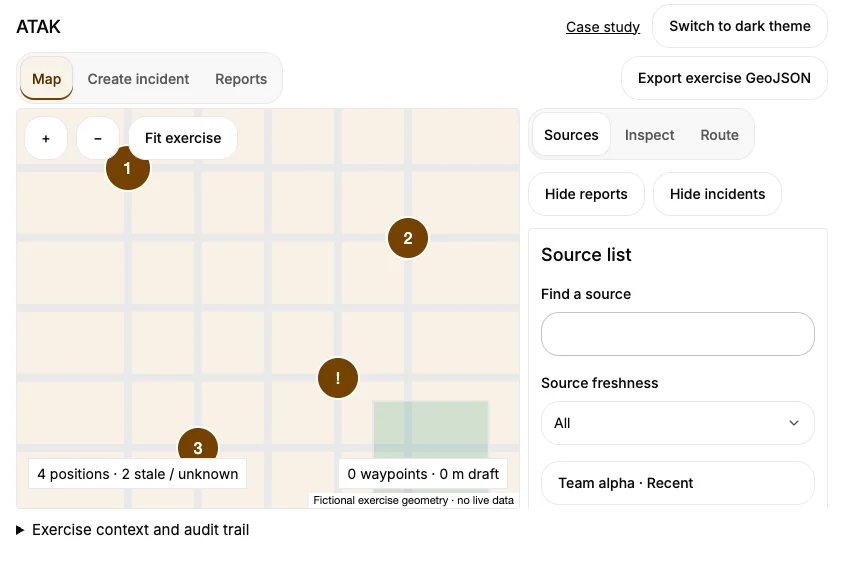
Mobile experience
Team status on a phone.
See how the same experience adapts to a smaller screen.
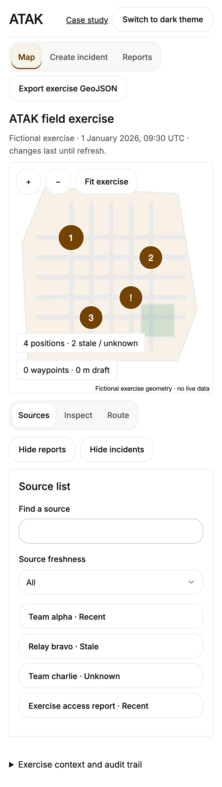
The problem
A busy situational-awareness interface must make source freshness and outstanding information clear without obscuring the underlying map and mission context.
The approach
A compact status workspace collects source activity, information categories and review items. Source status and freshness stay visible alongside the review queue.
- Which sources have reported?
- What information needs review?
- How fresh is the status picture?
Design and implementation
The Figma material explores a status interface, side panels, route lists and a JHRM-related sensor interface. The redesign studies the information architecture in a separate browser experience.
Each application has a distinct primary workspace. JHRM brings observations, incident records and exposure evidence into a review dashboard. BPTS connects transfer requests with reported facility capacity, receiving acknowledgments and coordination history. ATAK brings sources, incidents and editable routes into a mobile landscape map.
Charts and review queues stay connected. Operators can inspect source times, move through the workflow, review history and export exercise records. The public ATAK walkthrough is a web application, separate from the native Android application and TAK plugins.
Public walkthrough
The public walkthrough is a web application with exercise records and map views. It does not connect to radio, sensor or live positioning systems, and is separate from native ATAK and TAK plugins.