The Twofold identity
One clear
direction.
Two independent forms, working together. A purposeful identity for Newton & Carter’s work in agentic AI, human-machine teaming and digital engineering.
A working brand system, not a change to the business’s existing positioning. Existing, verified capability and founder content remains the source of truth.
01 / Foundation
Human judgment.
Machine capability.
Clear thinking
Start with the actual problem. Explain the approach in language a decision-maker can use.
Paired strength
Show the relationship between people and technology. Strategy and implementation belong together.
Deliberate progress
Make each next step concrete. Confidence comes from specificity, not superlatives.
02 / The signature
Keep the mark intact.
The approved Twofold consists of two exact, unaltered paths with a rising diagonal gap. Use supplied SVGs as the source of truth. Black and white logo files are copied directly from the approved kit.
- Clear space: at least one quarter of the mark’s visible height on every side. Measure from the artwork, not the file bounds.
- Minimum visible mark width: 24 px digitally or 6 mm in print. Full horizontal lockup: 200 px digitally or 50 mm in print.
- Use the mark alone for avatars and compact navigation; use the full lockup when the brand name needs introducing.
- Use ink on ivory and white on ink or neon. Keep good contrast and a quiet background.
- Never stretch, rotate, redraw, add effects, change the gap, outline the shape or typeset a replacement wordmark.
- The mark-inspired patterns are supporting graphics, never alternate logo artwork.
The wordmark is outlined from Liberation Sans Bold with custom spacing. Its shape is fixed regardless of the typeface used in page content.
03 / Colour
Quiet foundation. Clear signal.
Ink
#151715
Primary text / dark fields
Ivory
#F4F3EE
Primary canvas
Neon orange
#FF5A00
Action / emphasis
Pale neon
#FFE8D9
Supporting field
Let ink and ivory do most of the work. Use neon for a clear action, a meaningful highlight or one substantial graphic field. Pale neon supports secondary content. Muted #666B61 is for secondary text on ivory. Line #D5D6CE is for decorative dividers only.
Approved text pairs
Ink on ivory; neon on ivory; white on neon; neon on pale neon; muted on ivory; ink on pale neon.
Each passes WCAG AA for normal-sized text. See calculated contrast audit for exact ratios and methodology.
Use colour deliberately
Do not set ink text on neon or neon text on ink. Do not rely on colour alone for status, links or charts. Use labels, shapes and visible focus indicators.
04 / Typography
Useful, confident, unforced.
Liberation
Sans.
One family, two weights: Regular 400 and Bold 700. Bundled as self-hosted WOFF files under the SIL Open Font License 1.1; the full license is included. No third-party font request is required.
Working type scale
Display: 48–104 px / .96 line-height / −.04 em
Section heading: 32–64 px / 1.04 / −.035 em
Body: 18 px / 1.5 / normal tracking
Supporting text: 14–16 px / 1.5
Labels: 12 px / 1.4 / +.08 em, bold
Keep paragraphs to about 55–75 characters per line. Use sentence case in headings; uppercase is reserved for short labels. Avoid long passages in all caps.
05 / Layout + motion
Structure makes room
for the idea.
Spacing and grid
Use the 4 px base scale: 4, 8, 12, 16, 24, 32, 48, 64, 96, 128. Desktop: 12 columns, 24 px gaps, up to 1440 px content width. Mobile: 4 columns; collapse complex compositions to one column. Gutters move from 24 to 80 px.
Use generous section spacing, typically 64–144 px. Put related content together; separate different ideas with space before adding containers.
Components and accessibility
Favor square editorial fields and 4 px control corners. Buttons have at least 48 px height. Make interactive targets at least 44 × 44 px. Retain visible keyboard focus and semantic labels.
Motion is brief and functional: 180 ms, cubic-bezier(.2,0,0,1). Respect reduced-motion preferences. Avoid decorative infinite animation and parallax.
View CSS tokens View JSON tokens
06 / Graphic language
A system from the symbol.
Use a single large paired form as a focal point. Repetition can express systems; diagonal lanes express direction. All graphics are code-native SVG paths. Avoid AI clichés such as glowing brains, robot faces and abstract circuitry unless the subject genuinely calls for them.
For photography, prefer real people, real tools and real working environments. Use only approved or licensed images. Never imply a customer relationship, government endorsement, secure facility access or deployed capability through stock imagery.
07 / Voice
Plain language.
Technical substance.
How we sound
- Direct: state the problem before describing the technology.
- Specific: name the system, constraint or next action.
- Calm: avoid hype, fear and unsupported certainty.
- Responsible: explain where human oversight matters.
Claim discipline
Do not invent customer names, deployments, procurement status, contract vehicles, government awards, certifications, security clearances, testimonials or performance metrics.
Use a measurable claim only when its scope, source and approval are documented. Illustrations and sample copy are design examples, not evidence of delivery.
These are suggested voice examples. Publish only copy that accurately describes the company’s actual process and offering.
08 / Social + channel kit
Ready for the next format.

Square posts: 1200 × 1200. Landscape card: 1200 × 630. Keep the footer and logo locked; change the main message within its existing bounds. Use one message per graphic. Templates contain sample brand messaging, not fabricated client stories.
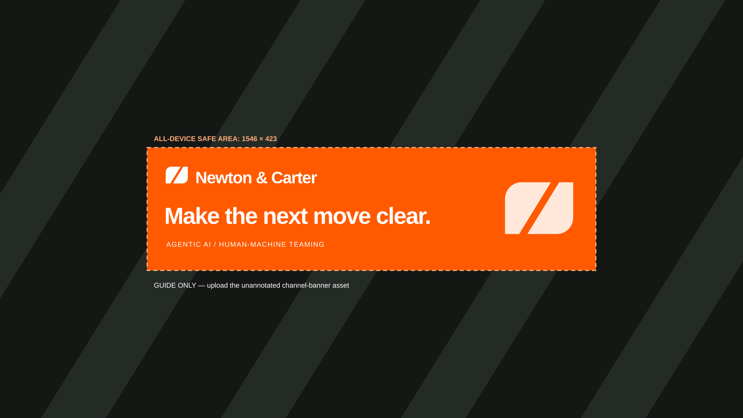
YouTube master: 2560 × 1440. Essential copy and identity fit inside the centered 1546 × 423 area, x = 507–2053, y = 508.5–931.5. Upload the unannotated PNG master; the safe-area guide is for review only. Device crops may vary; inspect the platform preview before saving.
09 / Handoff
Source of truth.
Use SVG for web and scalable production artwork. Use PNG for social and platforms that do not accept SVG. Delivered illustrations and social vectors use outlined type; they remain independent of installed fonts. The build script contains editable source copy and layout.
Copy the tokens and font directories together, or update relative font paths to match the application. Use the CSS custom properties rather than inventing extra colours and spacing values.
This identity is original design work, not a trademark clearance or legal guarantee of uniqueness. The supplied font license governs the font software; it does not require brand artwork or documents to use the same license.